Tuesday, May 17, 2011

Solarisation, Gradient Map and Gradient Tool


The first picture is a solarisation. Since this is a black and white picture, the contrast between the two is brought out. The second picture is a Gradient Map. This give the overall picture a very different color to and changes the over feeling of it. The last picture was made using the Gradient tool. This is two pictures that are blended together. Doing this can make a story out of the picture or just make it look like an interesting picture.


Creative Color-Vintage, Pictoralism and Contrast


In the first picture, there is kind of a yellow hue to the picture. This gives of the feeling that it is an older picture. In the second picture, there is very low saturation and some what of a silhouette. This allows for the picture to give off a darker feeling. In the bottom picture, you can see the high contrast between the white and the black on the wall in the background. Also, the orange and red on the wind chimes jump out at you.

Monday, April 11, 2011

Theme 1-Music and Text

From now until the rest of the year my pictures will all have the same theme. The theme that i will be working with is Music. I have been surrounded by music my entire life and it seems as if it will be with me for the rest of my life. Music has gotten me through good times and bad, and because of that I will always have a good relationship with it. The picture i have here is of a guitar, and to further show my respect for music i have added text. Adding text to a picture can do way more than just putting words in, it can help accent the message you are trying to get across. There are many way you can arrange your words and letters to accent that message even more so. For this picture i choose to add the text, "When words fall, music will rise", and the letters in the word "fall" looks like they are falling. I also have the entire "music will rise" part of the text lining the edge of the guitar going upwards. Instead of using Photoshop to add the text, I used Adobe Illustrator. Illustrator allows you to add text in many different styles. With the many different options, it is easier to find a style that will fit your photo perfectly.

Tuesday, April 5, 2011

Sharpen


Today we learned a new way to enhance our photos using photoshop. We learned how to sharpen our picture. Sharpening a picture allows the viewer to see more detail in the picture. As you can see in the before (first picture) and after (second picture) pictures, you can clearly see more detail in the after picture.

Thursday, March 24, 2011

Rhythm

For this assignment, we learned about rhythm in a picture. Rhythm lets the person who is looking at the picture see movement in a still photo. For example, in this picture I took many of the exact same photos, except i moved the ball to a different position in each one. In order to do this assignment, I blended different photos together and I had to use the selection tool again. I would pick one background picture, select a ball from a different picture, then bring that selection over to my background picture. After doing this many times, it looks as if the ball is traveling into the mug at the other end of the photo. Another tool we learned to use in photoshop were the dodge and burn tools. These tools allow us to make an object look darker or lighter. For example, I used the burn tool under each of the golf balls in order to make it look like there is a shadow under each of them. I also used the burn tool on the golf ball themselves in order to make them look like they were are very similar in color. Using the selection tool allows to make pictures that have rhythm in it and make pictures that look like this.

Color Emphasis

For this assignment, we used picture that we have previously taken, but using the selection tool, we learned how to make parts of a picture black and white while keeping the color on the other parts of the pictures. For example, in the first picture, you can see that his skin, clothing and everything else on him are black and white, except his eyes. Since his eyes match the color of the sky, I decided to keep his eyes the way they were. Making his whole body black and white and keeping the eyes in color really adds emphasis to the color of his eyes and the matching sky. For the second picture, I made everything but him black and white. The color of his skin and blue jacket against the black and white really makes him stand out. Using this method to enhance colors can convey many different messages. For example, you could say for this picture that he stands out and is unique compared to everyone else in the world. Doing the kind of coloring is only one of the many things you can do using the selection tool, andbeing able to know how to use is very helpful when editing photos.

Tuesday, March 22, 2011

Portraits and Lighting


For this assignment, we took portrait pictures of people using different types of lighting. The types of lighting we used were back lighting, front lighting, side lighting and 3/4th lighting. We also took pictures with artificial lighting and pictures with natural lighting. The first picture you see is the artificial lighting. Here i used 3/4 lighting. Side lighting and 3/4 lighting are very similar, but 3/4 lighting leaves a shadow in the shape of a triangle right on the side of the nose, while in side lighting a whole side of the face had a shadow over it. As for the second picture, I took this outside using natural lighting. I also tried using 3/4 lighting here, but since it was a cloudy day, you can't see many shadows. In photoshop we learned two new techniques to cover up blemishes. We used the actual blemish removing tool and we learned how to usesurface blur. Using these two tools, you can see less blemishes on the person's skin. We also learned about different lighting effects we can use on our pictures. The third picture has a lighting filter on it. This filter allows the picture to have a certain color to it. This certain color lets the picture have a specific mood and feeling to it. The fourth picture on here shows another lighting effect we learned to use. This lighting effect is called a lens flare. If you look on the right side of the picture, you can see a lighter spot. This adds more light to the picture and adds emphasis on certain areas of the picture.

Monday, March 21, 2011

White Balance-Clone Stamp and Vignette

For this assignment, I took different pictures using different White Balance settings. Too show the difference between using a normal White Balance mode and different White Balance modes, such as sunset or fluorescent light, I would take the same picture using first the normal mode then using a different mode. I also used a mode on my camera that had an automatic setting where the camera would automatically set the White Balance setting. Iused this mode on the picture to the left.I also learned about Clone Stamps. This is where you can add or take away things from your picture. In this picture you can see that i took away a brown dot on top of the red thing in the center of the flower (as you can see from the original picture down below). I also added purple in the top left of the picture to make the flower look more complete. I also added a vignette. A vignette is a layer of color that goes around the edges of the picture. In this picture, for example, I put on a vignette to add emphasis to the contrast in color between the white center and the purple outer part.

Monday, March 7, 2011

A Day in the Life of Lexi-ISO


For this assignment, i took pictures of a day in the life of my dog, Lexi. While taking these pictures, i was supposed to change my ISO settings on my camera in order to make the camera more sensitive to light. Unfortunately, I don't have the optioin of manually setting the ISO settings on my Camera, so i'll just talk about what i would've changed. ISO settings usually range from 100 to 1600. For lighter conditions, which are usually outside on a sunny day, you should use a lower ISO, and for a darker setting, usually in a darker room or with an overcast sky, you use a higher ISO. For example. the image on the right, i would have used a higher ISO. This is because the picture was taken inside in a darker room. After i took and edited all of my pictures using photoshop, I made a final collage of a day in the life of my dog, Lexi. This is the second picture on the right....which will be up tomorrow.

Monday, January 31, 2011

Artist Statment

There are a lot of different reasons for creating art, but I believe the biggest reason, for me, is expressing emotion with out using words. Arts meaning to me is way deeper than just a picture or a song. Every single art form tells a certain story and reflects the way the artist was feeling when they created that art, but in order to tell that story, something needs to inspire the artist first. Things that inspire can range from my family to various nature scenes. The way i usually express my inspirations is by creating a song on the piano relating to it. Up till now, most of the art i make is musical. I did take photography in my sophomore year, but that was only for a semester. The type of work i want to make this semester is something that can be visual, meaning i want to take pictures and edit them on a computer.

The artist i choose to analyze is Ralph Clevenger. He uses digital photography and takes pictures that mostly have to do with nature and many different forms of it. For example, he takes pictures of landscapes, animals, humans ect...

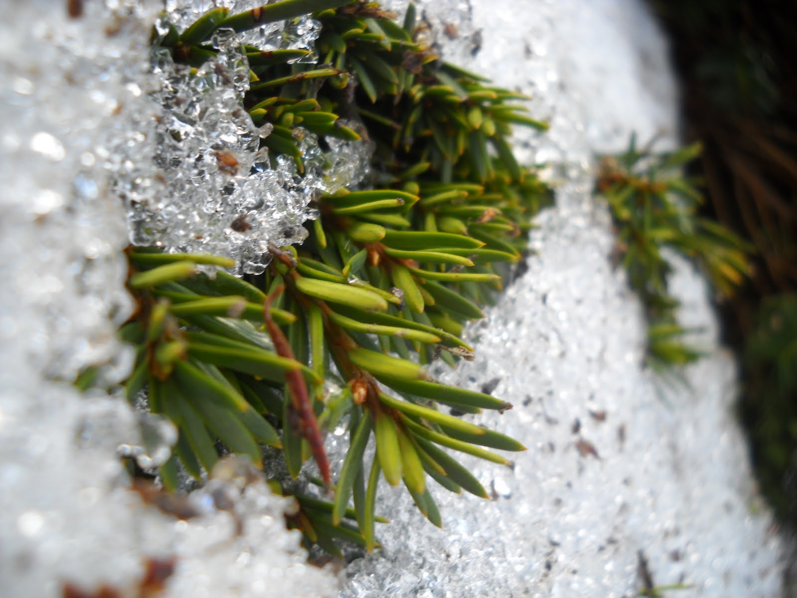
I personally like the pictures he takes, especially the ones that are of the earth. These are the types of images that inspire me and make me want to capture the true beauty of nature and show really how important nature is to the world. The picture to the left is one of my favorites because he takes an object that is so small in the world and makes look as if it could rule the world, showing that nature is truly more important that people view it. The website below is Ralph Celvenger's website, which shows he history and many different pictures he has taken.